
Scaling without losing simplicity.
Designing through Ninja’s evolution from fast-growing Q-commerce into the multi-vertical platform that later became a $1.5B unicorn.
ROLE
VP of Design
MARKET
Saudi Arabia
SCOPE
Product Strategy · Product Design · Design Systems · Team Leadership

ABOUT NINJA
From Q-commerce to a regional multi-vertical.
Ninja is a Saudi-born Q-commerce platform that evolved beyond rapid grocery delivery into a broader consumer platform spanning multiple categories, services, and commercial models.
When I joined
Ninja was scaling beyond its original Q-commerce model, expanding into new categories, services, and commercial models.
The ambition
Build a broader consumer platform while preserving the speed and simplicity that made the original experience work.
What followed
That growth introduced new product challenges across promotions, digital goods, subscriptions, fulfillment, navigation, and the underlying design system.
MY ROLE
Leading the experience while staying hands-on.
As VP of Design, I worked across product strategy, hands-on product design, design systems, and team leadership — partnering closely with Product, Engineering, Marketing, and business stakeholders as Ninja scaled.
Product direction
Shaped experience strategy, product priorities, and key customer journeys in partnership with Product and Engineering.
Hands-on design
Designed critical flows and solved complex interaction problems across promotions, digital products, subscriptions, and commerce.
Design systems
Built reusable components, patterns, and foundations to improve consistency and accelerate product delivery.
Team leadership
Led a three-person multidisciplinary design team spanning visual design, UX research, and product design — setting direction, reviewing work, mentoring the team, and maintaining quality across parallel product initiatives.
THE BUSINESS NEED
Growth reshaped the product’s needs.
As Ninja expanded beyond its original Q-commerce model, new business initiatives introduced product capabilities the original experience and infrastructure weren't designed to support at scale
1
Promotions at scale
Turn promotions into a scalable product capability.
Offers are fundamental to Q-commerce growth, but Ninja's early promotion setup wasn't built to support increasingly varied campaign mechanics and major brand partnerships at scale.
Need
Scalable promotion engine
2
Digital products
Expand the catalog beyond physical goods.
Adding digital products such as Amazon, Netflix, and PlayStation gift cards introduced a new fulfillment model — including secure code delivery, reveal, and post-purchase access.
Need
Digital fulfillment experience
3
Ninja Prime
Introduce a recurring revenue model.
Ninja Prime introduced a subscription model built around free delivery and member benefits, creating a new challenge: communicate the value clearly and make joining feel seamless within the existing shopping experience.
Need
Subscription experience
4
Design system
Build a foundation for a growing product.
With no established design system, the expanding product needed shared foundations, components, patterns, and brand guidance to improve consistency and support faster product development.
Need
Scalable design foundation
THE PRODUCT CHALLENGE
More capabilities. More complexity. One customer experience.
Each growth initiative introduced its own rules, states, fulfillment models, and interactions — but customers still needed Ninja to feel like one coherent product.
1
More capability. More decisions.
Every new capability introduced more choices, rules, and information for customers to process.
2
Different models. Different behaviors.
Promotions, digital products, and subscriptions brought fundamentally different interaction and fulfillment models into the same product.
3
More states. More opportunities for inconsistency.
New journeys introduced more states, exceptions, and outcomes that could fragment the experience.
The platform could become more sophisticated. The experience couldn’t become harder to understand.
THE PRODUCT APPROACH
Absorb complexity into the system, not the customer experience.
Scale the platform’s capabilities without scaling the customer’s cognitive load.
PLATFORM EXPANSION
New capabilities and business models expand what the platform needs to support.
Promotions at Scale
Digital Products
Ninja Prime
Product Scale
INCREASING PRODUCT COMPLEXITY
Each expansion introduces new behaviors, states, and dependencies.
Multiple offer models
Digital + physical orders
Different fulfillment models
Expanded product states
Membership & subscription states
More journeys & interactions
COMPLEXITY ABSORBED BY THE SYSTEM
Shared patterns handle variation without fragmenting the experience.
Shared interaction patterns
Shared commerce logic
Fulfillment-aware journeys
Scalable design system
Consistent product states
CUSTOMER EXPERIENCE
The underlying complexity stays invisible to the customer.
Predictable
Understandable
Consistent
Effortless
DECISION INPUTS
Designing with evidence, not assumptions.
Product decisions were shaped through a mix of customer feedback, market signals, collaborative workshops, technical validation, and prototype testing — helping us reduce uncertainty before moving into implementation.
Different inputs answered different questions — what customers struggled with, what the market was doing, what the business needed, and what could realistically be built.
CUSTOMER SIGNALS
Customer support feedback
Recurring pain points and friction reported by customers.
App Store / Play Store reviews
Public feedback revealing usability issues and unmet expectations.
MARKET CONTEXT
Competitor & market research
Patterns, benchmarks, and opportunities across the market.
ALIGNMENT
Stakeholder workshops
Business goals, constraints, and priorities aligned across teams.
VALIDATION
Prototype testing
Early concepts tested before committing to implementation.
Engineering feasibility reviews
Technical constraints and implementation trade-offs validated early.
DESIGN DIRECTION
Synthesize
Validate
Build
PROMOTIONS AT SCALE
Building a promotion engine for Q-commerce growth.
Promotions were a core growth lever for Ninja, with campaigns running across major consumer brands and an expanding range of offer mechanics. The existing setup could support basic promotions, but it wasn’t structured to scale as campaign requirements became more varied.
What was changing
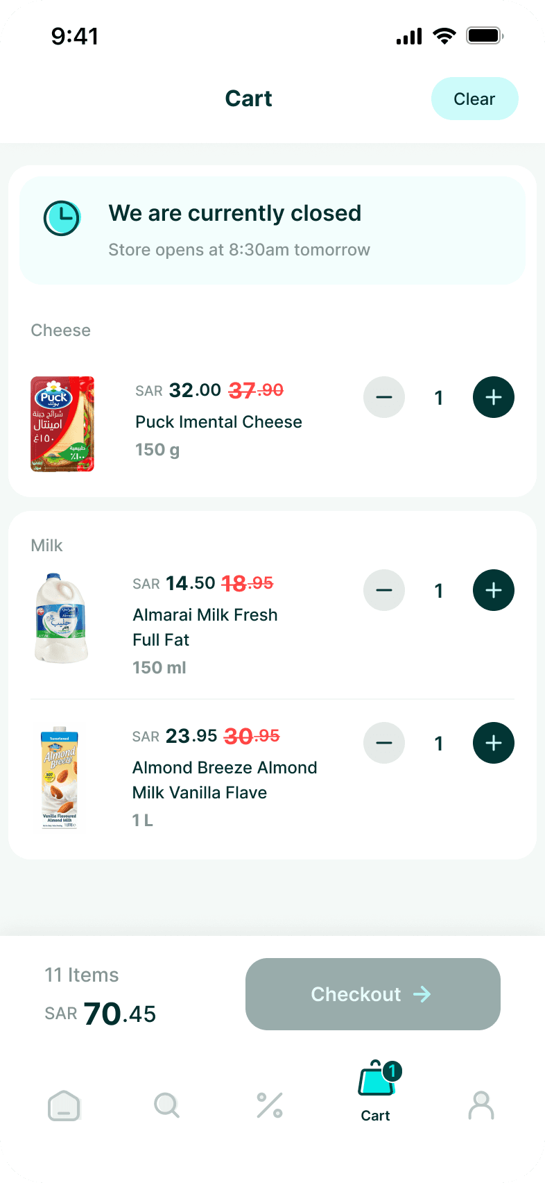
Offers were no longer just simple discounts. Campaigns could require different purchase quantities, free or discounted rewards, same- or different-item rewards, eligibility rules, inventory conditions, and cart behavior.
How could we support multiple promotion models without designing and building every new campaign as a separate feature?

Brands partnering with Ninja on product promotions
THE SYSTEM APPROACH
From individual offers to a shared model.
Instead of treating every promotion as a separate feature, I broke the mechanics into shared variables — defining what triggers an offer, what the customer receives, how it is applied, and how the experience responds to different conditions.
Promotion models
Different campaigns combined different triggers and rewards, while solving the same customer need: understand what to do and what you’ll get.
Buy X
GET
Same item free
Buy X
GET
Different item free
Buy X
GET
Discounted reward
Buy X
GET
Choose reward
Multi-buy
GET
Tiered reward
Variable mapping
I decomposed those mechanics into the variables that actually change: trigger, reward, application, value, and inventory.
Trigger
// What activates the promotion.
SKU
Category
Quantity
Spend
Reward
// What the customer receives.
Same SKU
Different SKU
Selection
Discount
Application
// How the reward is applied.
Automatic
Customer-selected
Value
// How the reward is calculated.
Free
% off
Fixed price
Inventory
// How reward inventory is managed.
Shared
Separate
Limited
ONE SHARED INTERACTION MODEL
Different promotion mechanics, one predictable customer journey.
Discover
Qualify
Redeem
Confirm
Apply
FROM SYSTEM TO EXPERIENCE
One promotion language across the journey.
The shared model then translated into predictable states, exception handling, and reusable components across the shopping journey.
Promotion behavior & state model
Defining how promotions progress—and how the experience responds when eligibility, inventory, or promotion conditions change.
Conditions change
Inventory or eligibility is no longer valid
S2A
REWARD UNAVAILABLE
Reward unavailable due to inventory or eligibility.
Conditions restored
Inventory or eligibility becomes valid again.
S0
PROGRESSING
Moves toward eligibility by meeting offer requirements.
S1
QUALIFIED
Meets requirements to unlock the reward.
S2
REWARD AVAILABLE
Reward is validated and ready to be applied.
S3
APPLIED
Promotional value is added to the customer’s cart.
S4
CONFIRMED
Final promotional value is clearly shown at checkout.
Exception scenarios
Key situations that can change the offer state — and how the system responds.
REWARD REMOVED
Customer removes the reward from the cart.
REWARD CHANGED
Customer selects another eligible reward.
QUANTITY INCREASES
Added quantity may unlock a higher reward tier.
QUALIFYING ITEM REMOVED
A required qualifying item is removed from the cart.
REWARD OUT OF STOCK
Selected reward is no longer available.
QUANTITY REDUCED
Cart quantity falls below the eligibility threshold.
PRICE CHANGES
Price update affects qualifying spend or value.
ITEM SUBSTITUTED
Replacement item requires eligibility validation.
FULFILLMENT CHANGES
Delivery method or location affects eligibility.
OFFER CONFLICT
Another promotion takes priority over this offer.
ELIGIBILITY CHANGES
Customer or cart no longer meets requirements.
OFFER EXPIRES
Promotion expires while the customer is shopping.
Exception response in practice
How one exception is evaluated and communicated to the customer.
When a customer changes their cart, the promotion needs to respond immediately and predictably. Instead of simply removing the reward, the experience re-evaluates the offer, updates its state, and shows the customer what they need to do next.
QUANTITY REDUCED
Cart quantity falls below the eligibility threshold.
RE-EVALUATE
Check quantity against promotion rules.
UPDATE STATE
Reward returns to Progressing.
S0
PROGRESSING
Moves toward eligibility by meeting offer requirements.
UI RESPONSE
Show the remaining requirement.
A shared recovery model
Different exceptions trigger different checks, but follow the same pattern: re-evaluate the offer, transition to a valid state, and communicate what changed.
Different exceptions. One predictable recovery model.
FROM MODEL TO COMPONENT
One promotion component. Multiple mechanics.
The shared interaction model was translated into a configurable component that could adapt to different promotion types, reward states, and customer actions without creating a new UI pattern for every campaign.
Promotion component system
Rather than creating campaign-specific UI, I built a reusable set of promotion components that could communicate the offer mechanic, reward value, redemption state, and supporting rules consistently across the shopping journey.
Mechanics change. Components adapt. The product language stays consistent.
OFFER



STATE

INCENTIVE

RULE / CONTEXT

Logic in action
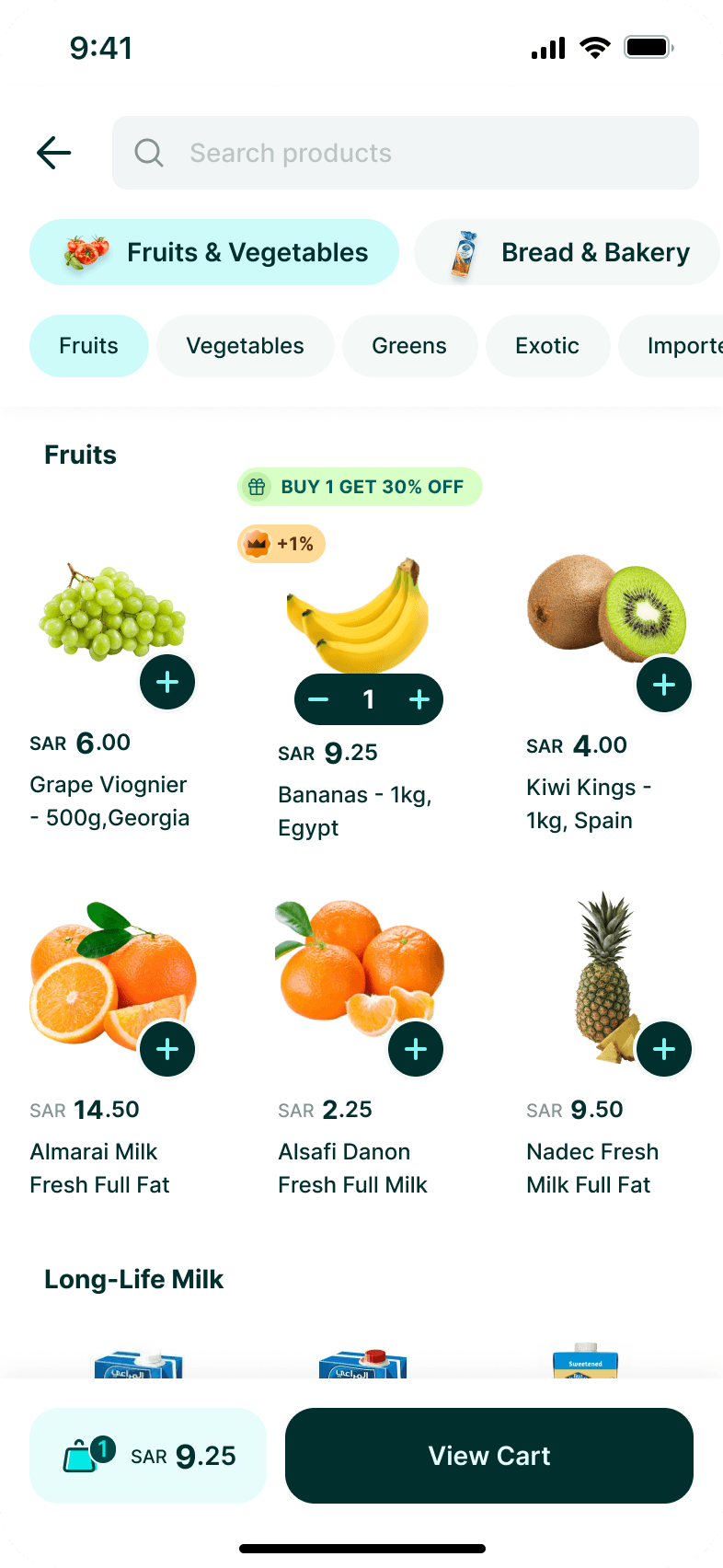
The same promotion logic adapts existing commerce components as the customer moves from discovery to redemption and confirmation.
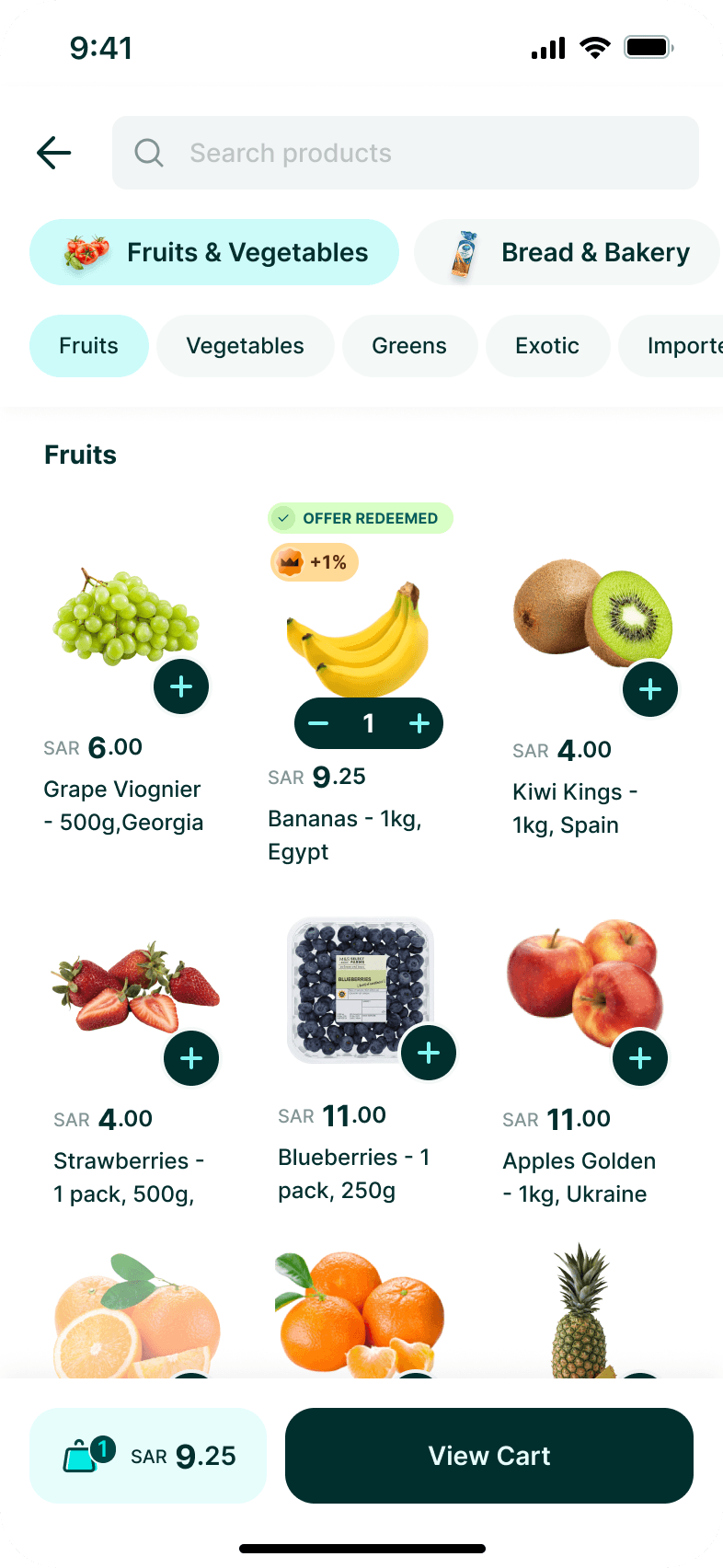
One promotion state. Reflected across every shopping surface.
AVAILABLE

REDEEMED

CART / APPLIED
Redemption component
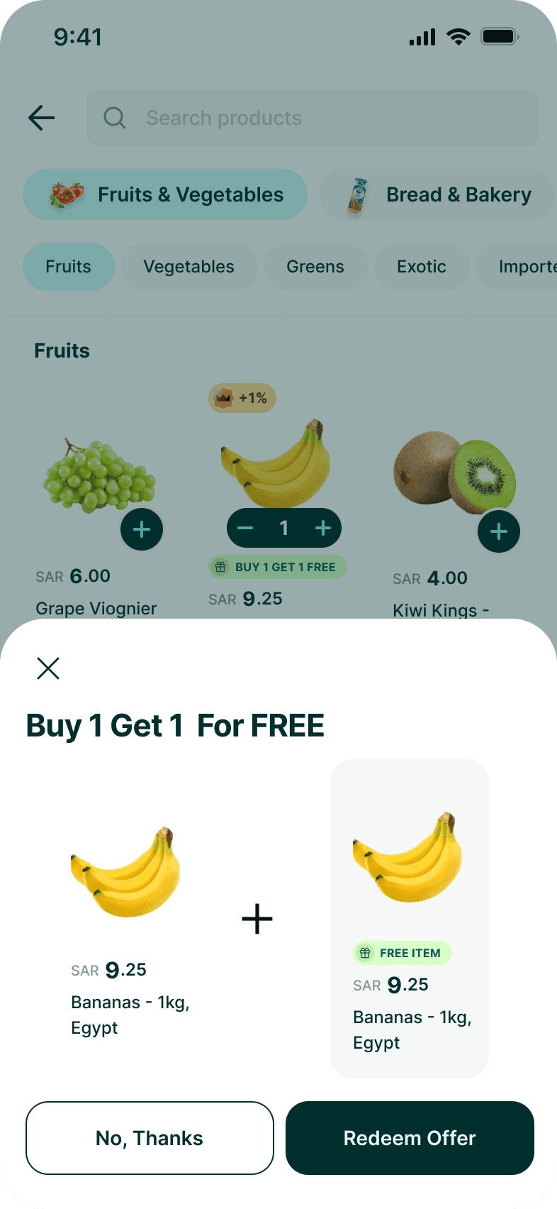
When a promotion requires customer action, redemption becomes a dedicated interaction rather than an automatic state change. The component adapts to the offer while keeping the experience familiar.
What adapts
Reward type, eligible products, pricing, selection rules, and actions change based on the promotion mechanic.
Different rewards. One predictable redemption pattern.
SAME ITEM · FREE

SAME ITEM · DISCOUNTED

DIFFERENT ITEM · SELECT

CHALLENGE 01
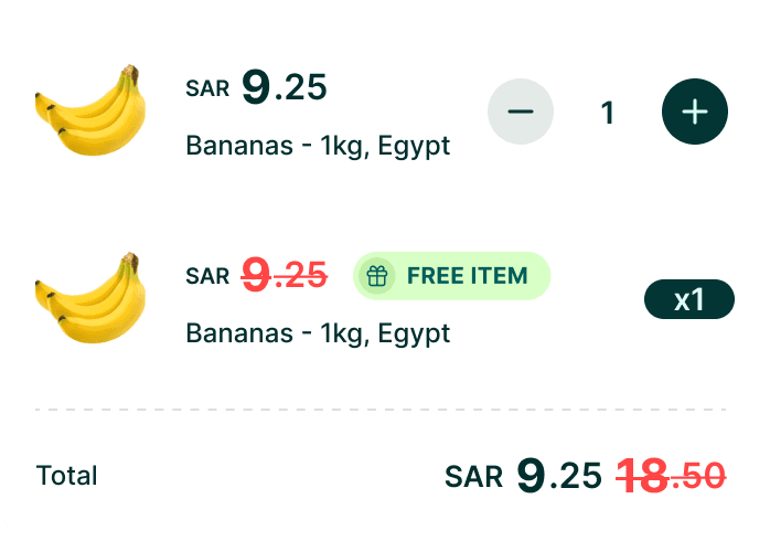
Buy 1, Get 1 Free
Making “free” unmistakable.
Problem
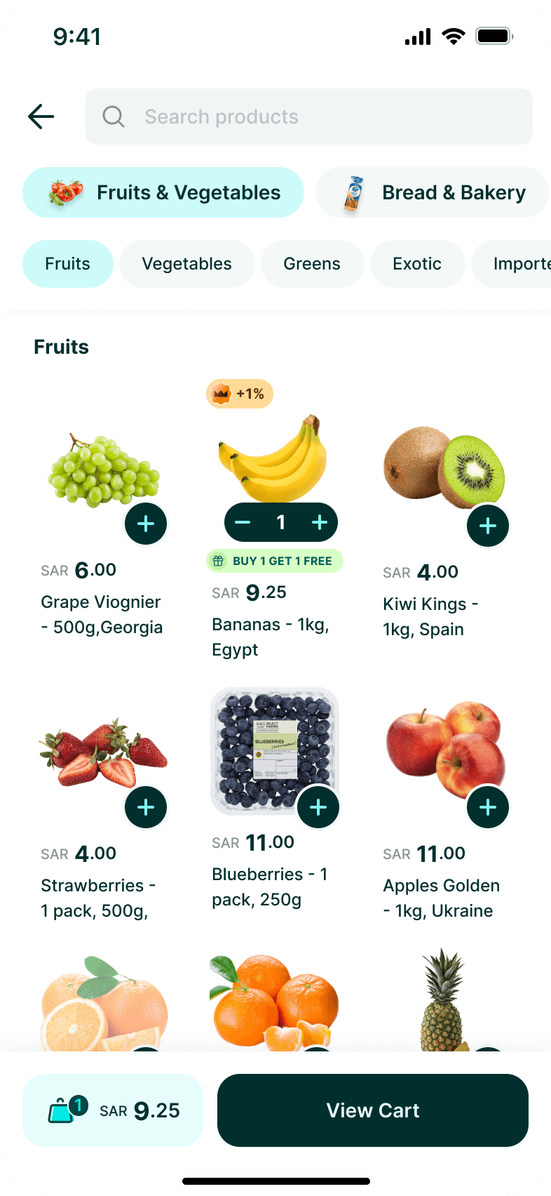
When a customer buys an eligible item, another unit becomes free. Simply increasing the quantity from one to two, however, could make it appear that both items were being purchased.
The experience needed to clearly distinguish what the customer buys from what Ninja adds as the reward.
Solution
The offer is communicated directly on the product and surfaced for explicit redemption once the customer qualifies.
After redemption, the cart treats the reward as a distinct promotional item, clearly separating the purchased product from the free unit and reducing its price to zero.
Key UX decision
Treat the offer as 1 purchased item + 1 promotional item — not quantity 2.

CHALLENGE 02
Buy 1, Get the Second Item 30% Off
Showing where the discount actually goes.
Problem
A discounted second item introduces a different mental model. Both units have value, but only one receives the promotional price.
If represented as a single quantity and combined price, customers could struggle to understand which item was discounted and how the total was calculated.
Solution
I kept the redemption interaction consistent with the free-item model, but changed the pricing representation.
The discounted unit remains visibly separate, showing its original and promotional price so customers can understand exactly where the saving has been applied.
Key UX decision
Keep the interaction familiar while allowing the pricing model to change.
CHALLENGE 03
Buy 1, Get a Different Item 30% Off
Turning a promotion into a selection experience.
Problem
Different-item promotions introduce another layer of complexity: the reward is no longer predetermined.
The experience needed to communicate when the offer was unlocked, show only eligible products, limit the customer to one selection, and make it clear which item receives the discount and how that discount is calculated.
Solution
Once the qualifying item is added, the offer opens a focused selection experience containing the eligible rewards.
The customer selects one item, while the interface communicates the pricing rule upfront — 30% off the lowest-priced item. After selection, the offer returns to the shopping experience with a clear redeemed state.
Key UX decision
Make reward selection explicit, while exposing the pricing rule before the customer commits.

One framework. Different promotion mechanics.
Same-item rewards, discounted rewards, and customer-selected rewards introduced different business rules while following the same underlying interaction model.
Discover
Qualify
Redeem
Confirm
Apply
Separating promotion mechanics from customer-facing behavior enabled new offer types to reuse the same interaction model.
DIGITAL ORDERS
Bringing digital and physical products into one order.
Ninja was expanding beyond products that could be picked, packed, and delivered. Digital cards introduced a different fulfillment model — purchased alongside groceries, but available instantly.
Digital and physical products could exist in the same order, but behaved differently after purchase. The experience needed to make what gets delivered, what becomes available instantly, and what happens next immediately clear.
How do you introduce instantly fulfilled digital products into a commerce journey designed around physical delivery?
Rather than creating a separate experience, I integrated digital goods into the existing commerce model — sharing checkout and order history while introducing the behaviors needed for instant access.
Extending one order across two fulfillment models
Physical products and digital goods shared the same order, but followed different paths after purchase. The experience needed to support both without creating two separate journeys.
ONE ORDER
Contains both product types
PHYSICAL PRODUCTS
Purchase → Prepare → Deliver
DIGITAL GOODS
Purchase → Generate → Reveal → Use
SHARED ORDER EXPERIENCE
One place to access and manage both
Designing for instant access
Unlike physical products, digital goods become usable immediately after purchase. The order experience needed to make access clear while protecting the value until the customer chose to reveal it.
Purchased
Unrevealed
Revealed
Copied
PURCHASED
Payment confirmed; digital value generated.
UNREVEALED
Value available, protected by default.
REVEALED
Value intentionally exposed by the customer.
COPIED
Value copied with immediate confirmation.
One digital product, multiple access states.
One order, two timelines
Physical and digital products share the same transaction, while progressing through different fulfillment states.
ORDER CONFIRMED
One transaction, two fulfillment paths.
PHYSICAL FULFILLMENT
DIGITAL FULFILLMENT
PREPARING
OUT FOR DELIVERY
DELIVERED
AVAILABLE
One order model, without forcing different products into the same fulfillment lifecycle.
When digital fulfillment doesn’t go as planned
Instant fulfillment creates a different class of exceptions from physical delivery. The experience needed to communicate these states without breaking the shared order model.
GENERATION
// How the digital value is created.
Generating
Generated
Generating
Failed
ACCESS
// How the customer accesses the digital value.
Unrevealed
Revealed
Copied
AVAILABILITY
// Whether the digital value can be accessed.
Available
Unavailable
ORDER
// How order changes affect the digital product.
Active
Cancelled
Refunded
Exception response in practice
A closer look at how a failed digital fulfillment state is detected, contained, and communicated without affecting the rest of the order.
GENERATION FAILED
Digital value could not be generated.
SYSTEM EVALUATION
Digital item · generation status
SYSTEM ACTION
Isolate failed digital item
UI RESPONSE
Show failure state and next action
S0
ORDER CONTINUITY
Physical fulfillment continues
Handle digital exceptions at the product level while keeping the order as the shared experience.
CHALLENGE 01
Mixed-product orders
One checkout. Two fulfillment models.
Problem
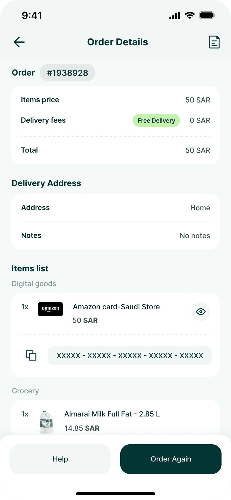
A single order could contain both groceries and a digital card. Although customers paid for them together, the products behaved differently after purchase: physical goods required delivery while the digital product became available directly inside the app.
Creating separate orders would fragment the experience. Treating them identically would hide an important difference in how customers receive what they purchased.
Solution
I kept both product types within the same order while creating clear grouping inside Order Details.
Digital products received their own section and interaction model, while physical products continued to follow the familiar grocery structure.
This preserved one transaction and one order history while making the different fulfillment models understandable.
Key UX decision
Separate by fulfillment behavior, not by transaction.

CHALLENGE 02
A product that becomes a credential
Making digital value accessible without exposing it by default.
Problem
Unlike a grocery item, the value of a digital card exists in its redeemable code. Once purchased, customers needed an easy way to retrieve and copy that code — without permanently exposing it whenever Order Details was opened.
Solution
The code remains concealed by default and can be deliberately revealed when needed.
Once visible, customers can copy it directly, with immediate system feedback confirming that the action succeeded.
Key UX decision
Treat the card code as an actionable credential, not ordinary order information.
CHALLENGE 03
Reordering across product types
Making “Order Again” work when not everything behaves the same.
Problem
Reordering a mixed purchase introduced a different problem: the previous order could contain products with fundamentally different behaviors. A digital card and a grocery item could be purchased together, but they could not simply be treated as identical line items when rebuilding the order.
The experience needed to translate the previous mixed order back into purchasable items while preserving the distinction between product types and allowing customers to adjust quantities before placing the new order.
Solution
The Order Again experience reconstructs the previous purchase as an editable cart, grouping Digital Cards and Grocery separately while maintaining a single order action and combined total.
Key UX decision
Preserve product-type differences without fragmenting the repurchase journey.
One commerce experience. Different fulfillment models.
Digital cards joined Ninja’s existing commerce model, sharing checkout and order history while introducing instant digital fulfillment.
Ninja could expand what it offered without changing how customers understood an order.
Discover
Purchase
Fulfill
Access
NINJA PRIME
Introducing membership without interrupting the shop.
Ninja Prime introduced a new relationship between customers and the product. Instead of engaging only when placing an order, customers could subscribe for ongoing benefits such as free delivery and cashback.
Prime needed to be discoverable within the existing shopping journey, communicate enough value to justify a recurring commitment, and make joining feel like a natural extension of ordering from Ninja.
How do you introduce a paid membership into a transactional Q-commerce experience without adding friction to the shopping journey?
Rather than treating Prime as a separate product, I integrated membership discovery, plan selection, and payment into the existing commerce experience — keeping the journey connected to behaviors customers already understood.
CHALLENGE 01
Introducing Prime inside an existing shopping journey.
Make membership visible without turning commerce into an ad.
Problem
Prime needed enough visibility for customers to discover it, but Ninja’s home experience was already focused on getting users quickly into products, categories, offers, and repeat purchases.
Making Prime too passive would hurt discovery. Making it too dominant could interrupt the core shopping journey.
Solution
Prime was introduced within the existing commerce experience rather than treated as a disconnected destination.
The entry point communicates the proposition at the moment customers are already thinking about ordering, creating a bridge from transactional value to membership value without changing the primary purpose of Home.
Key UX decision
Introduce membership in the context where its benefits become relevant.


CHALLENGE 02
Turning benefits into a reason to subscribe.
Explain the value before asking for commitment.
Problem
A recurring subscription requires a different decision from purchasing groceries. Customers needed to understand what they would receive in return before being asked to choose a plan or provide payment.
Prime therefore couldn't rely on branding or a generic “Subscribe” CTA alone.
Solution
The Prime experience establishes the value proposition first, surfacing the membership benefits before introducing plan selection.
Benefits such as free delivery and cash back are presented as concrete advantages connected to how customers already use Ninja, making the subscription easier to evaluate in practical terms.
Key UX decision
Sell the value before selling the plan.
CHALLENGE 03
Turning recurring commitment into a simple decision
From benefits to plan selection without unnecessary friction.
Problem
Once customers understood Prime, the next decision was no longer whether Prime has value, but which commitment makes sense for them.
Introducing multiple durations, pricing and savings could easily turn a lightweight subscription into a comparison exercise.
Solution
Plan options were consolidated into a focused selection step where duration, price and relative value could be compared without leaving the Prime journey.
The selected plan then carries forward into confirmation, keeping the transition from consideration to commitment explicit.
Key UX decision
Reduce subscription choice to the information required to make the decision.

CHALLENGE 04
Making payment feel like continuation, not another journey.
Complete the subscription inside a familiar payment model.
Problem
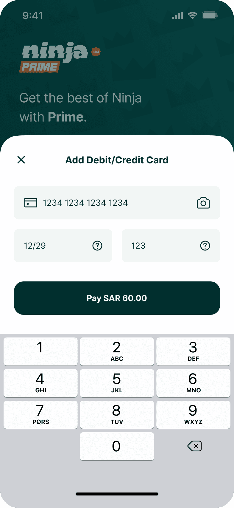
After deciding to subscribe, customers still needed to complete payment. Introducing an unfamiliar checkout specifically for Prime would add friction at the point of highest intent.
Solution
The subscription moves into familiar payment patterns, allowing customers to use an existing payment method or add a new card without breaking the flow.
This keeps the final step focused on completing the decision customers have already made rather than asking them to learn another interaction model.
Key UX decision
Reuse familiar commerce patterns when the mental model doesn't need to change.

Prime changed the commercial model without making Ninja feel like a different product.
Prime extended Ninja beyond individual transactions, integrating membership discovery, plan selection, and payment into the existing commerce experience.
Discover
Understand
Choose
Confirm
Pay
Prime
BRAND SYSTEM
Extending consistency beyond the product.
As Ninja scaled, the brand needed to work across more than the interface — spanning product, marketing, communications, and emerging customer touchpoints.
I developed Ninja’s Brand System Quick Guide, translating the identity into a practical framework teams could apply as the company expanded.


DESIGN SYSTEM
Building the system behind the product.
As Ninja expanded across new features, categories, and commercial models, solving individual experiences wasn’t enough. The product needed a shared foundation that could keep teams moving quickly without allowing the experience to fragment.
Recurring interface patterns needed to become reusable components, states, and interaction rules — supporting consistency across Arabic and English while giving Design and Engineering a shared language.
How do you increase the speed of product development without allowing a rapidly expanding experience to become inconsistent?
Rather than standardizing screens after they were designed, I helped establish a system from the recurring behaviors already emerging across the product — turning them into reusable foundations, components, and patterns.

Foundations
Creating a shared visual and interaction language.
Components & Patterns
Turning recurring interactions into reusable product patterns.
Product Application
Scaling the system across real product experiences.
APPLE × NINJA
Taking the experience beyond the app.
As order tracking became a core part of Ninja’s experience, the opportunity was to make delivery progress visible without requiring customers to repeatedly open the app.
I designed Ninja’s Dynamic Island experience to surface live order status directly within iOS — turning key delivery moments into glanceable, contextual updates.
Designing for a new interaction surface.
Dynamic Island introduced a very different set of constraints from designing inside the app.
Information had to remain useful at a glance, adapt across compact and expanded states, and communicate progress within a highly constrained system surface.
Working with Apple MENA.
The work was developed in collaboration with Apple’s MENA team, refining how Ninja’s delivery experience translated into the Dynamic Island interaction model.
The resulting experience was featured on Apple’s Saudi website during the iPhone 15 release, positioning Ninja as an example of how local apps could make use of the iPhone’s system-level experiences.


Designed for glanceability.
Order status, ETA, and progress were reduced to the information customers needed in the moment — creating a Live Activity that could be understood without reopening Ninja.
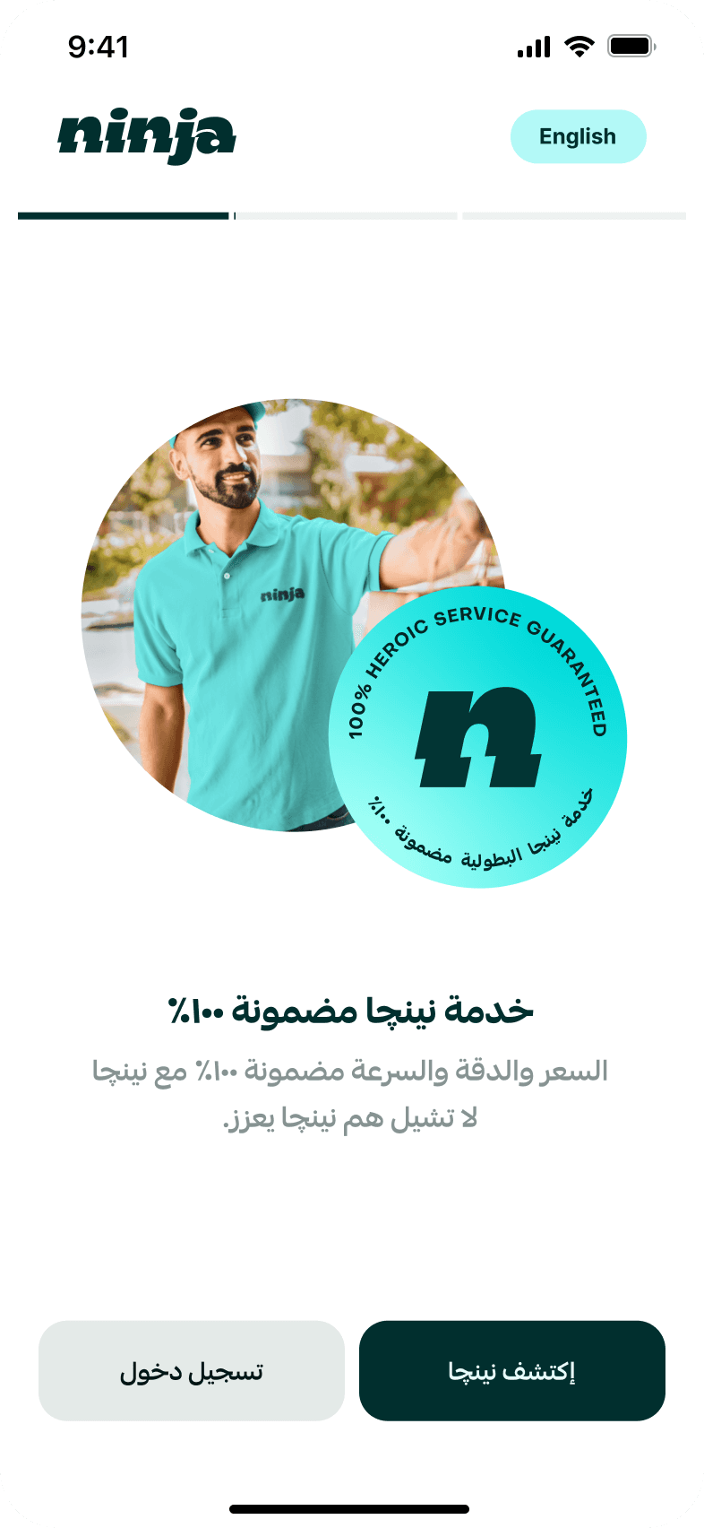
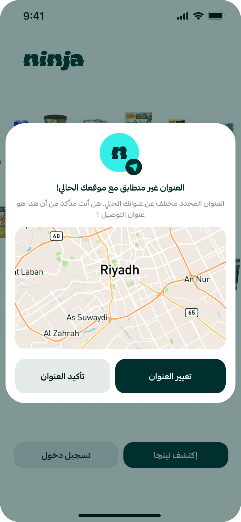
Designed for Arabic, not just translated.
The same interaction system was adapted for RTL — adjusting hierarchy, alignment, and content direction while preserving the same delivery states and glanceability.


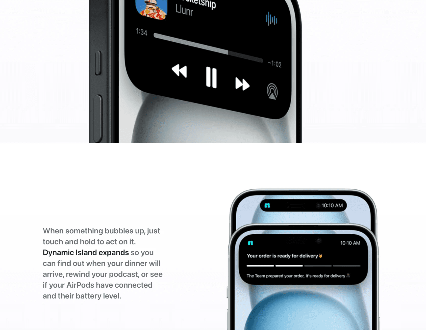
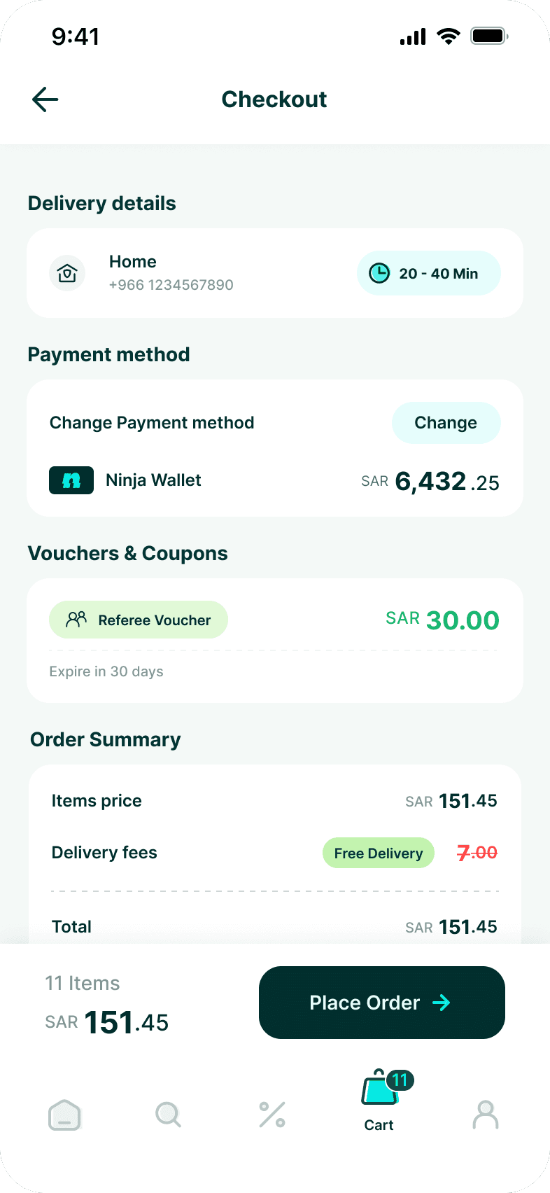
One delivery experience. Designed to work across language, direction, and system surfaces.










BUSINESS IMPACT
Designing for measurable growth.
The work helped Ninja scale its product, brand, and customer experience without adding the same level of complexity to every new initiative. Across product delivery, team efficiency, customer growth, and new commercial models, the focus was on creating foundations that could support the next stage of the business.
Speed & efficiency
How shared foundations reduced delivery time across product and brand work.
Once the core product and brand systems were established, the team could move from concept to execution with less setup, fewer repeated decisions, and less rework. Reusable patterns accelerated prototyping, visual production, and new feature delivery while keeping quality consistent.
Typical team turnaround before vs. after establishing the shared product and brand foundations; approximate internal working ranges.
~50% less time
Prototype turnaround
Concept
Testable prototype
Before
5-7 days
After
2-4 days
Reusable components and interaction patterns reduced setup time, helping ideas move from concept to validation faster.
~50% less time
Visual / graphic production
Brief
Ready-to-publish asset
Before
4-6 days
After
2-3 days
Shared brand foundations reduced repeated decisions around layout, typography, color, and visual treatment.
Reusable by default
New feature rollout
New requirement
System pattern
Before
Bespoke solution
After
Reusable pattern
Established patterns let new requirements build on proven product behavior instead of starting from a bespoke solution.
Growth & reach
The scale Ninja reached as the product continued to expand.
During this period, Ninja’s customer base and market adoption grew rapidly — with weekly active users more than doubling and downloads reaching significant peaks.
These company-level metrics provide context for the scale at which the product and design foundations were operating.
Sources
Sensor Tower, Q2–Q3 2023 · CST Saudi Internet Report 2023
The #1 claim is supported by Ninja’s own announcement citing CST’s Saudi Internet Report 2023.
~114%
Weekly active-user growth
~245K → 524K+
Apr 2023 → Sep 2023
Weekly active users more than doubled during this period, reflecting Ninja’s rapid adoption as the product expanded.
#1
Most downloaded food & delivery app
Saudi Arabia · 2023
Ninja reached the top of its category in Saudi Arabia during a period of rapid product and market expansion.
202K
Peak weekly downloads
Q3 2023
Weekly downloads peaked at roughly 202K, showing the pace at which new customers were entering the ecosystem.
OUTCOMES
Designing for the next stage of growth.
The strongest outcome wasn't a single feature. It was creating a product foundation that could accommodate new business models and experiences without fragmenting the customer journey.
This work supported Ninja’s evolution from a focused Q-commerce experience into a broader multi-vertical platform.
A more extensible product
Promotions, digital goods, subscriptions, and new verticals could build on shared patterns rather than creating disconnected experiences.
Greater consistency at scale
Reusable components, interaction patterns, and product behaviours created greater coherence across features, Arabic and English.
A stronger foundation for teams
Shared patterns and design-system principles gave Product, Design, and Engineering a common framework for evolving the experience.
WHAT I TOOK FROM IT