
Making healthy eating feel effortless.
Designing a flexible meal-plan experience that turns goals, preferences, scheduling, delivery, and hundreds of choices into something simple to understand and easy to control.
ROLE
Product Design Consultant
MARKET
UAE / Dubai
SCOPE
Product Strategy · UX/UI · Personalization · Service Design · Design Systems

More than a meal plan. An everyday food experience.
RightBite brings together dietitian-designed meal plans, personalized nutrition, flexible delivery, and a growing ecosystem of food experiences.
The product challenge was to make all of that flexibility feel simple. Customers needed to discover the right plan, understand what was included, personalize it around their goals and preferences, and stay in control as their needs changed.
My work focused on shaping that experience across the product — from onboarding and plan discovery to plan configuration, meal selection, delivery flexibility, Express meals, and the systems connecting them.
Personalization creates value — and complexity.
The more RightBite adapts to an individual customer, the more decisions the product has to manage: goals, meal types, dietary preferences, delivery days, plan duration, flexibility, benefits, and what happens when plans change.
The opportunity was to keep that complexity behind the experience — giving customers meaningful control without making them configure every detail before they could move forward.
How do you make a highly personalized meal-plan experience feel simple enough to choose, flexible enough to live with, and clear enough to trust?
Customer Context
Ninja Product Growth
Goals
Preferences
Lifestyle
Schedule
Personalization & plan logic
The right plan for me
MY ROLE
Leading the experience while staying hands-on.
My role combined product direction, hands-on design, design systems, and team leadership — moving between strategic decisions and detailed execution as the product evolved.
As VP of Design, I worked closely with stakeholders across Product, Engineering, Marketing, and the business to align priorities, shape product direction, and translate business objectives into coherent customer experiences.
I also helped grow and evaluate the design team — conducting technical interviews, portfolio reviews, and designer evaluations to maintain a strong bar for craft, product thinking, and execution.
Product direction
Shaping experience strategy across key journeys and new product capabilities in close collaboration with stakeholders.
Hands-on design
Solving complex product problems and defining high-impact interactions and experiences.
Design systems
Building reusable patterns and foundations to improve consistency, quality, and delivery speed.
Team leadership
Guiding designers, reviewing work, raising the quality bar, and supporting the team’s growth.
COMPLEX OFFERS
Making complex offers feel simple.
Ninja’s promotion engine supported multiple offer models, from free duplicate items to discounted rewards and different-item offers.
The challenge wasn’t simply communicating that an offer existed. Each model introduced different rules around eligibility, reward selection, quantity, pricing, and cart calculation — while the experience still needed to remain predictable.
How do you create one understandable promotional experience when the underlying offer models behave differently?
Rather than treating each promotion as an isolated feature, I designed them as variations of the same commerce system — with consistent patterns for discovery, value, redemption, and cart behavior.
CHALLENGE 01
Buy 1, Get 1 Free
Making “free” unmistakable.
Problem
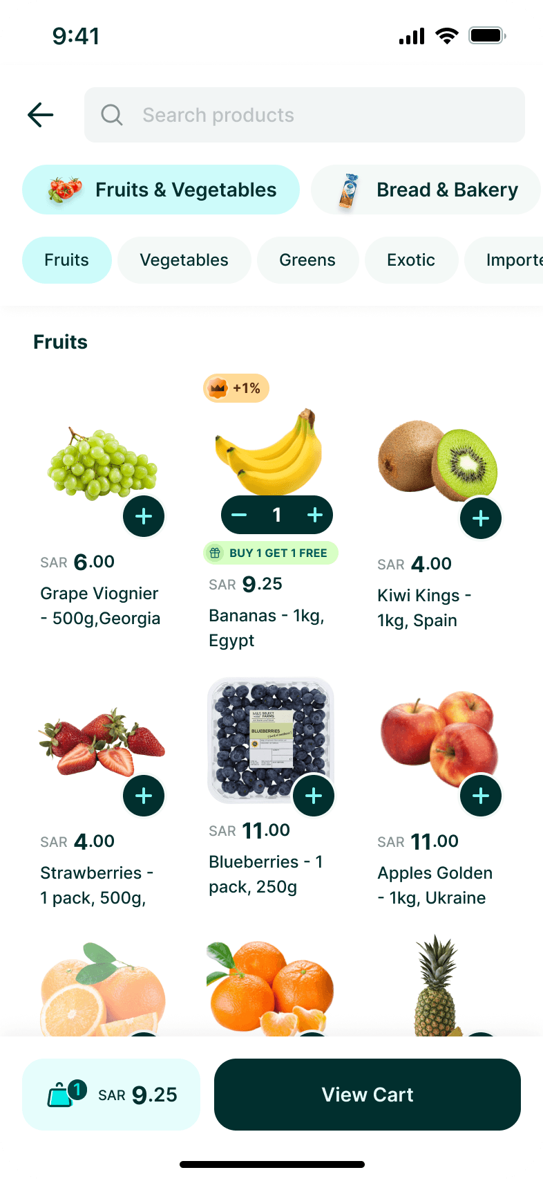
When a customer buys an eligible item, another unit of the same product becomes free. But simply increasing the quantity from one to two could make it appear that the customer was purchasing two items.
The experience needed to distinguish between what the customer bought and what Ninja added as the reward.
Solution
The offer is communicated directly on the product, then surfaced for explicit redemption once the customer becomes eligible.
After redemption, the product state confirms that the offer has been applied, while the cart separates the purchased item from the free unit and shows its original price reduced to zero.
Key UX decision
Treat the offer as 1 purchased item + 1 promotional item — not quantity 2.
CHALLENGE 02
Buy 1, Get the Second Item 30% Off
Showing where the discount actually goes.
Problem
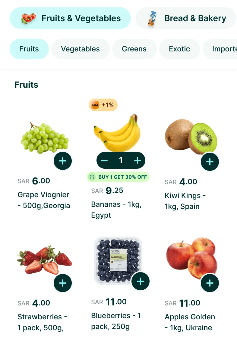
A discounted second item introduces a different mental model. Both units have value, but only one receives the promotional price.
If represented as a single quantity and combined price, customers could struggle to understand which item was discounted and how the total was calculated.
Solution
I kept the redemption interaction consistent with the free-item model, but changed the pricing representation.
The discounted unit remains visibly separate, showing its original and promotional price so customers can understand exactly where the saving has been applied.
Key UX decision
Keep the interaction familiar while allowing the pricing model to change.
CHALLENGE 03
Buy 1, Get a Different Item
Turning a promotion into a selection experience.
Problem
Different-item promotions introduce another layer of complexity: the reward is no longer predetermined.
The system needed to tell customers that they had unlocked an offer, show which products qualified, allow only the permitted selection, and communicate how the discount would be calculated.
Solution
Instead of automatically adding a reward, the eligible state opens a focused selection experience.
Qualified products are presented together, selection is constrained by the promotion rules, and supporting copy explains how pricing is applied before the customer continues shopping.
Key UX decision
When the reward requires a decision, make selection part of redemption.

Different rules. One predictable interaction model.
Different promotional rules followed the same customer-facing model, keeping eligibility, redemption, and cart behavior predictable.
The promotion engine could grow more sophisticated without making the customer experience more complicated.
Discover
Qualify
Redeem
Understand
Apply
DIGITAL ORDERS
Bringing digital and physical products into one order.
Ninja was expanding beyond products that could be picked, packed, and delivered. Digital cards introduced a different fulfillment model — purchased alongside groceries, but available instantly.
Digital and physical products could exist in the same order, but behaved differently after purchase. The experience needed to make what gets delivered, what becomes available instantly, and what happens next immediately clear.
How do you introduce instantly fulfilled digital products into a commerce journey designed around physical delivery?
Rather than creating a separate experience, I integrated digital goods into the existing commerce model — sharing checkout and order history while introducing the behaviors needed for instant access.
CHALLENGE 01
Mixed-product orders
One checkout. Two fulfillment models.
Problem
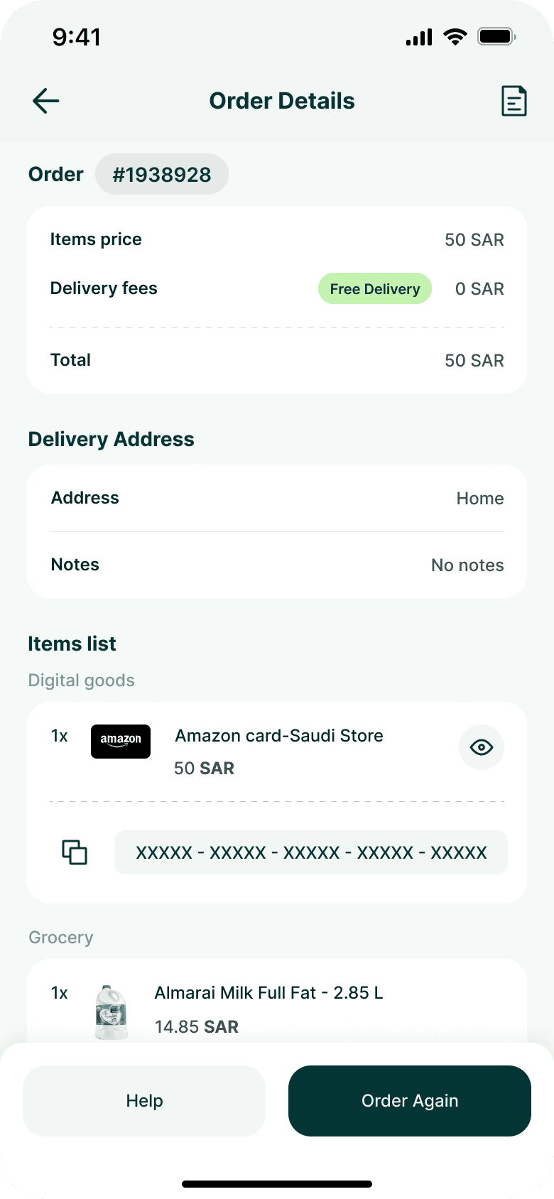
A single order could contain both groceries and a digital card. Although customers paid for them together, the products behaved differently after purchase: physical goods required delivery while the digital product became available directly inside the app.
Creating separate orders would fragment the experience. Treating them identically would hide an important difference in how customers receive what they purchased.
Solution
I kept both product types within the same order while creating clear grouping inside Order Details.
Digital products received their own section and interaction model, while physical products continued to follow the familiar grocery structure.
This preserved one transaction and one order history while making the different fulfillment models understandable.
Key UX decision
Separate by fulfillment behavior, not by transaction.

CHALLENGE 02
A product that becomes a credential
Making digital value accessible without exposing it by default.
Problem
Unlike a grocery item, the value of a digital card exists in its redeemable code. Once purchased, customers needed an easy way to retrieve and copy that code — without permanently exposing it whenever Order Details was opened.
Solution
The code remains concealed by default and can be deliberately revealed when needed.
Once visible, customers can copy it directly, with immediate system feedback confirming that the action succeeded.
Key UX decision
Treat the card code as an actionable credential, not ordinary order information.
CHALLENGE 03
Reordering across product types
Making “Order Again” work when not everything behaves the same.
Problem
Reordering a mixed purchase introduced a different problem: the previous order could contain products with fundamentally different behaviours. A digital card and a grocery item could be purchased together, but they could not simply be treated as identical line items when rebuilding the order.
The experience needed to translate the previous mixed order back into purchasable items while preserving the distinction between product types and allowing customers to adjust quantities before placing the new order.
Solution
The Order Again experience reconstructs the previous purchase as an editable cart, grouping Digital Cards and Grocery separately while maintaining a single order action and combined total.
Key UX decision
Preserve product-type differences without fragmenting the repurchase journey.

One commerce experience. Different fulfillment models.
Digital cards joined Ninja’s existing commerce model, sharing checkout and order history while introducing instant digital fulfillment.
Ninja could expand what it offered without changing how customers understood an order.
Discover
Purchase
Fulfill
Access
NINJA PRIME
Introducing membership without interrupting the shop.
Ninja Prime introduced a new relationship between customers and the product. Instead of engaging only when placing an order, customers could subscribe for ongoing benefits such as free delivery and cashback.
Prime needed to be discoverable within the existing shopping journey, communicate enough value to justify a recurring commitment, and make joining feel like a natural extension of ordering from Ninja.
How do you introduce a paid membership into a transactional Q-commerce experience without adding friction to the shopping journey?
Rather than treating Prime as a separate product, I integrated membership discovery, plan selection, and payment into the existing commerce experience — keeping the journey connected to behaviors customers already understood.
CHALLENGE 01
Introducing Prime inside an existing shopping journey.
Make membership visible without turning commerce into an ad.
Problem
Prime needed enough visibility for customers to discover it, but Ninja’s home experience was already focused on getting users quickly into products, categories, offers, and repeat purchases.
Making Prime too passive would hurt discovery. Making it too dominant could interrupt the core shopping journey.
Solution
Prime was introduced within the existing commerce experience rather than treated as a disconnected destination.
The entry point communicates the proposition at the moment customers are already thinking about ordering, creating a bridge from transactional value to membership value without changing the primary purpose of Home.
Key UX decision
Introduce membership in the context where its benefits become relevant.


CHALLENGE 02
Turning benefits into a reason to subscribe.
Explain the value before asking for commitment.
Problem
A recurring subscription requires a different decision from purchasing groceries. Customers needed to understand what they would receive in return before being asked to choose a plan or provide payment.
Prime therefore couldn't rely on branding or a generic “Subscribe” CTA alone.
Solution
The Prime experience establishes the value proposition first, surfacing the membership benefits before introducing plan selection.
Benefits such as free delivery and cash back are presented as concrete advantages connected to how customers already use Ninja, making the subscription easier to evaluate in practical terms.
Key UX decision
Sell the value before selling the plan.
CHALLENGE 03
Turning recurring commitment into a simple decision
From benefits to plan selection without unnecessary friction.
Problem
Once customers understood Prime, the next decision was no longer whether Prime has value, but which commitment makes sense for them.
Introducing multiple durations, pricing and savings could easily turn a lightweight subscription into a comparison exercise.
Solution
Plan options were consolidated into a focused selection step where duration, price and relative value could be compared without leaving the Prime journey.
The selected plan then carries forward into confirmation, keeping the transition from consideration to commitment explicit.
Key UX decision
Reduce subscription choice to the information required to make the decision.


CHALLENGE 04
Making payment feel like continuation, not another journey.
Complete the subscription inside a familiar payment model.
Problem
After deciding to subscribe, customers still needed to complete payment. Introducing an unfamiliar checkout specifically for Prime would add friction at the point of highest intent.
Solution
The subscription moves into familiar payment patterns, allowing customers to use an existing payment method or add a new card without breaking the flow.
This keeps the final step focused on completing the decision customers have already made rather than asking them to learn another interaction model.
Key UX decision
Reuse familiar commerce patterns when the mental model doesn't need to change.
" Prime changed the commercial model without making Ninja feel like a different product"
Prime extended Ninja beyond individual transactions, integrating membership discovery, plan selection, and payment into the existing commerce experience.
Discover
Understand
Choose
Confirm
Pay
Prime
DESIGN SYSTEM
Building the system behind the product.
As Ninja expanded across new features, categories, and commercial models, solving individual experiences wasn’t enough. The product needed a shared foundation that could keep teams moving quickly without allowing the experience to fragment.
Recurring interface patterns needed to become reusable components, states, and interaction rules — supporting consistency across Arabic and English while giving Design and Engineering a shared language.
How do you increase the speed of product development without allowing a rapidly expanding experience to become inconsistent?
Rather than standardizing screens after they were designed, I helped establish a system from the recurring behaviors already emerging across the product — turning them into reusable foundations, components, and patterns.

Foundations
Creating a shared visual and interaction language.
Components & Patterns
Turning recurring interactions into reusable product patterns.
Product Application
Scaling the system across real product experiences.
OUTCOMES
Designing for the next stage of growth.
The strongest outcome wasn't a single feature. It was creating a product foundation that could accommodate new business models and experiences without fragmenting the customer journey.
This work supported Ninja’s evolution from a focused Q-commerce experience into a broader multi-vertical platform.
A more extensible product
Promotions, digital goods, subscriptions, and new verticals could build on shared patterns rather than creating disconnected experiences.
Greater consistency at scale
Reusable components, interaction patterns, and product behaviours created greater coherence across features, Arabic and English.
A stronger foundation for teams
Shared patterns and design-system principles gave Product, Design, and Engineering a common framework for evolving the experience.
WHAT I TOOK FROM IT
Absorb complexity into the system, not the customer experience.
Ninja reinforced something that has shaped how I approach product design: growth inevitably creates complexity, but customers shouldn't have to carry that complexity themselves.
The most effective solutions were rarely isolated screens. They came from understanding the underlying product logic, finding behaviours that repeated across different problems, and turning those behaviours into systems that could scale.
It also reinforced the value of staying hands-on while leading. Staying close to the product connected detailed interaction decisions with broader product direction, while leadership created the structure for those decisions to scale beyond an individual designer or feature.
As products scale, design shifts from solving individual experiences to building the systems that allow many experiences — and many teams — to evolve coherently.

© 2026 Moe Slah. All rights reserved.